
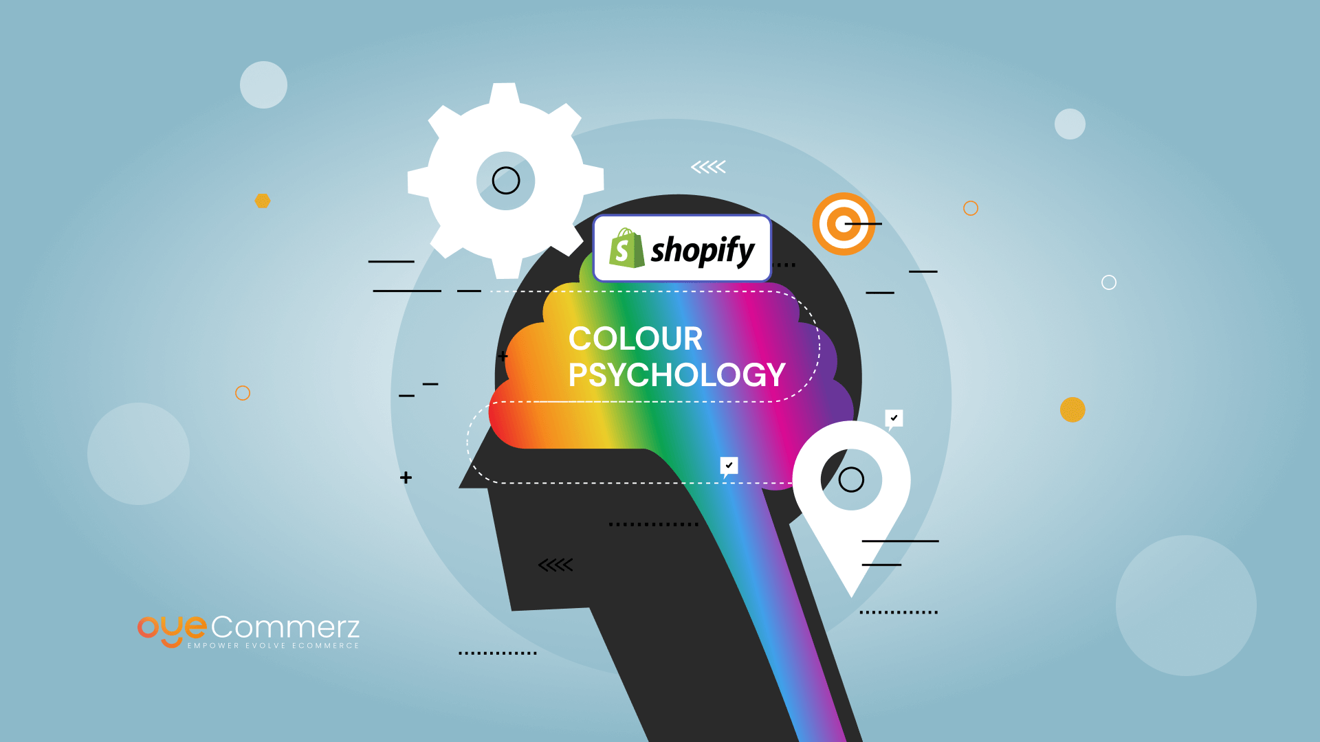
Color is more than just an aesthetic choice; it’s a powerful tool in communicating feelings and creating an emotional connection with your audience. For Shopify store owners and designers, understanding color symbolism is crucial as it directly influences how buyers perceive and engage with your store. With countless e-commerce sites competing for attention, selecting the right color palette can help your store stand out, build credibility, and enhance sales. This blog delves into how color psychology impacts Shopify theme development and provides actionable tips on optimizing your store’s visual appeal with the expertise of a Shopify theme development company.
Table of Contents
ToggleUnderstanding Color Psychology
Color psychology is the study of the impact of colors on the behaviour and emotions of people. It is an area of psychology, art, and marketing that proclaims that there are colors that produce certain reactions. For instance, red is used to convey vigour and passion while blue gives an impression of reliability and tranquility. This knowledge is very important for Shopify store owners who wish to develop an emotional bond with their audiences.
Otherwise, the moment we look at a particular color, there is a production of certain chemicals in the brain that in one way or another other affects our behavior. For instance, warm breaks such as red and yellow will lead to excitement or hunger while cool breaks such as blue and green will make one relax. Being aware of such signs can assist Shopify designers in choosing the right color that reflects the spirit of the brand.
Effects of Color on Consumer Behavior
In addition to aesthetics, colors influence customers’ actions and choices while navigating a website. Here’s how various colors can influence consumer actions:
- Red: This color is said to grab the attention of the customers because it triggers a ‘sense of loss’ which is helpful when one is for instance having clearance sales or forms of products that are available for a limited time only. It can also increase appetite thus making it suitable for Web sites with a food theme.
- Blue: For customers, the color blue is reassuring, which is why it is used by most financial and healthcare service sites. This is a peaceful color that can make customers remain for more time on certain sites and feel less stressed.
- Green: Green is the color of growth that characterizes healthy relationships in a society. It is mainly used by brands that wish to give off a message of tranquility, physical well-being, or ecological sensitivity. Green is also linked with wealth hence its usefulness in calls to action involving saving and other business-related investment.
- Yellow: Optimistic and loyal, yellow can be attention-getting and elicit feelings of happiness. Nevertheless, it’s one of those colors that multiply excessive use can turn into frustration and anxiety.
- Black: Appealing to status, and classy black color is significant for a high-quality product website to represent luxury.
Knowledge of these color effects enables Shopify store owners to create a visual experience that is fitting to their brand and one that will appeal to their targeted consumers.
Influence of Color Psychology on Shopify Theme Creation
When using color in the Shopify theme, it is not as simple as choosing colorful designs that are aesthetically pleasing; it is about selecting colors that will change these customers’ perceptions. Here’s how you can leverage color psychology to optimize your Shopify store:
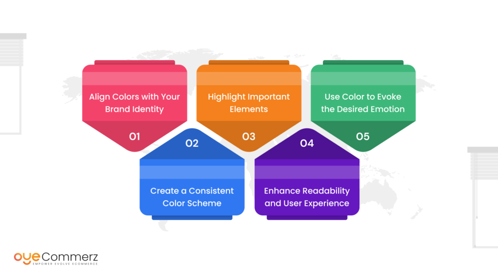
Align Colors with Your Brand Identity
To effectively integrate your brand identity with your store design, it is essential to ensure that your color scheme aligns with the brand’s personality and values. For a mature and classy brand, a profound color palette is appropriate, whereas bright and vivid colors are ideal for a youthful and energetic brand. Conversely, a corporate and formal brand should opt for a more subdued and muted color scheme. Shopify themes offer extensive customization options, making it possible to perfectly match your brand’s colors and reinforce its identity.
Create a Consistent Color Scheme
Complexity and consistency are the two principles that are dominant in design. Using a consistent color scheme makes objects stunning and it gives a more eye-pleasing look and the store becomes easily recognizable by the customers. Make the main features using one primary color, use the second color for less noticeable items such as backgrounds and Shadows, and the final color for text and insignificant items. It also serves to avoid bombarding the customers once they are in your store but offers them a more natural way to buy products.
Highlight Important Elements
Contrast can be used to prompt visual focus on certain components for example calls action buttons, sales promos, or new products. For instance, if you have used blue color as the dominant color in your website, a button fashioned in orange or red will be a conspicuous button and everyone will want to click on it.
Enhance Readability and User Experience
Color in itself is an important aspect in the designing of any webpage or website and can influence the readability and the overall usability of the content. Always make a point of having a decent contrast between what you’re going to write and the background that you choose. Low contrast results in eye fatigue, hence, the bounce rate will be high and the visitors will spend less time on your site.
Use Color to Evoke the Desired Emotion
When selecting colors to evoke specific emotions, it’s important to remember the Impact of Mobile Design on Shopify Plus Stores. Mobile users are particularly sensitive to how colors appear on smaller screens, which can influence their emotional response to your store. By optimizing your color choices for mobile, you can ensure a consistent and compelling brand message that resonates with all users, regardless of their device.
When implemented strategically, the use of these colors ensures that a Shopify store owner can come up with a good-looking store that would stir the emotions of the customers and cause them to buy from the store.
Common Mistakes to Avoid with Color in Shopify Themes
Colors are one of the most effective ways in e-commerce, but at the same time–they might be disastrous if used wrong. Here are some common mistakes to avoid when designing your Shopify theme:
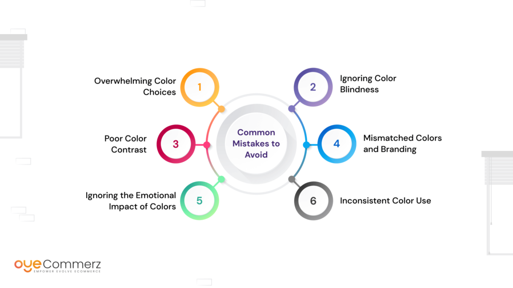
Overwhelming Color Choices
When too many colors are used they tend to dominate and make the user somewhat uncomfortable thus substandard experience is given. Take care not to use many colors in your website design since the limited number will shift well with your branding.
Ignoring Color Blindness
About 8 percent of Men and 0. 5% of women are known to be colorblind hence they may not have normal vision when it comes to color. Do not use color as the only means of relaying key messages. In addition to colors, other signal options are possible, for example, patterns, labels, and icons.
Poor Color Contrast
Lack of distinction between text and background may cause readability issues, therefore, posing a poor user interface to the content. You can easily check the contrast ratio and thus guarantee that your site is accessible to people with disabilities.
Mismatched Colors and Branding
When choosing your colors you should always consider the identity and the values of your brand. Inconsistencies in the shades of the used color and the branding strategy may sometimes give a wrong signal to the clients and in the process reduce the effectiveness of the image of the brand.
Ignoring the Emotional Impact of Colors
One disadvantage that is derived from the failure to factor in the effects of colors on emotions is the potential alienation of your target consumers from the store. For instance, the use of the color red in a setting such as a store that occupies a focus on relaxation may perhaps confuse clients.
Inconsistent Color Use
It is also important to refrain from using colors incoherently all over your store because will make your store look less professional and cluttered. Ensure that all pages and every element are consistent with your chosen color scheme for visual harmony.
In considering the above-discussed mistakes, their effects are mitigated to allow for a visually good-looking Shopify store that would be appealing to consumers and a platform that will have the capability to convert the consumers.
Design Your Shopify Masterpiece with OyeCommerz!
Transform your Shopify store’s design to captivate your audience and drive conversions. Our expert team combines cutting-edge design with deep psychological insights to create themes that resonate emotionally and enhance user experience. Whether you’re looking to refresh your color palette or start from scratch, we tailor solutions to align with your brand’s unique identity and goals.
Don’t let color choices hold you back—contact OyeCommerz today to elevate your Shopify store and see the impact of thoughtful design in action. Your customers will thank you!
Contact to Migrate your Site to Shopify Now
Conclusion
The role of color psychology in Shopify theme development is one of the most compelling aspects of the e-commerce landscape, as it directly taps into the emotions and behaviors of consumers. When selecting colors for your Shopify store, it’s essential to understand how different hues influence buyer perceptions and decisions. By leveraging this knowledge, Shopify store owners can incorporate colors that resonate with customers and support a strong branding strategy.
For a Shopify theme development agency, color perception extends beyond mere aesthetics; it involves strategically choosing colors that enhance your brand narrative and connect with your audience on a deeper level. Selecting the right color scheme not only gives your Shopify store a distinct competitive advantage but also fosters customer trust, ultimately driving higher sales and engagement.