Typography is everywhere in the context of modern e-commerce: it is one of the integral components of first impressions that determine the further success of the store in a matter of seconds. While eye-catching product images and the right choice of color schemes can attract more attention, typography is less noticeable but plays an important role in the success of the user experience, and the company’s readability and image. If you have been struggling as to why some e-commerce shops felt warm and had less what could be more comfortable to get around; then typeface is one of the key factors.
This blog is going to discuss why and how typography in Custom Shopify theme development is important and provide you with tips and tricks on how to make better use of it to boost your store.
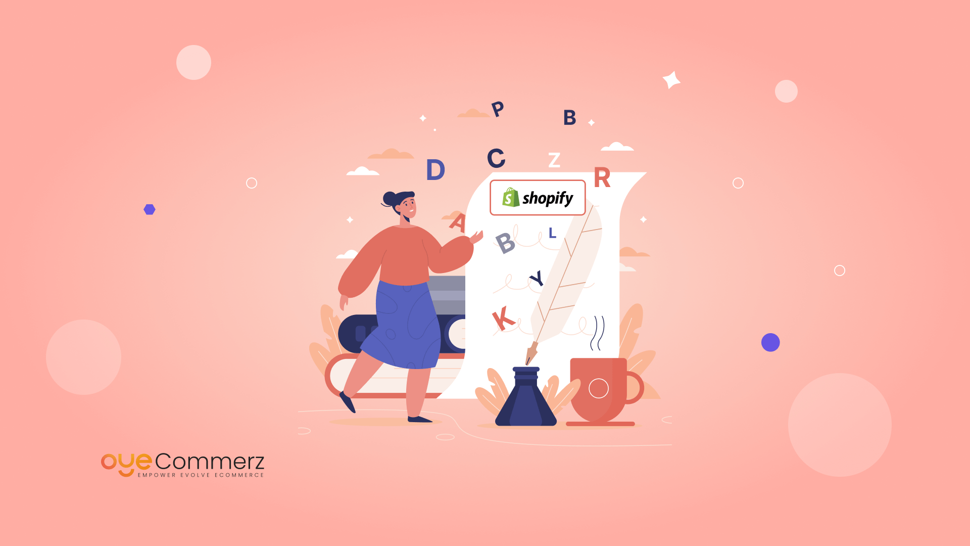
Typography in E-Commerce Web Site Design
Typography is not about choosing nice fonts; it is about utilizing type to help convey information and support the user’s experience. In a nutshell, for e-commerce sites, creating text that is visually appealing and informative is all.
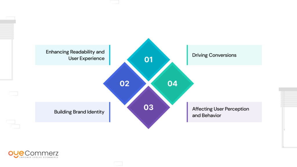
Enhancing Readability and User Experience
In certain contexts, Typography is very central in making or marring the readability quotient. The choice of appropriate fonts and their right size help to avoid the problem of readability of the contents in both the PC and in the pockets. This is very important to ensure visitors can effectively navigate through your site as can be desired. According to a study by MIT, 90% of information transmitted to the brain is visual, and visuals are processed 60,000 times faster in the brain than text
Building Brand Identity
The fonts you wish to use for your Shopify theme tell the persona of your brand. Whether the controlled look of a serif typeface or the clean lines of a truly sans-serif typeface, typography plays a vital role in supporting and re-emphasizing the look and branding that your business is keen to promote.
Affecting User Perception and Behavior
Typography in the right way serves to impact the perspective, that the users have regarding the particular brand. For instance, playful fonts are likely to ‘work’ with younger audiences while traditional fonts ‘work’ with professionals. Typography influences feelings and can elicit specific behaviours, for instance, a person makes a purchase, or fills in a newsletter subscription form.
Driving Conversions
Expert font selection significantly boosts conversion rates by making calls-to-action (CTAs) more visible and visually engaging. The typography used in buttons and links within your Shopify theme must be concise, easily recognizable, and clearly communicate the next steps to the user. The impact of Shopify theme on conversion rates is substantial, as well-chosen fonts can guide users more effectively and encourage them to take action.
Understanding Typography in Web Design
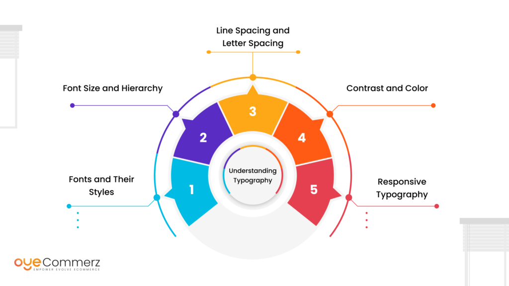
Typography in web design is a far broader concept than fonts only. This is made of several factors, which if combined in the right manner, are likely to enhance the effectiveness of the text that you are using.
Fonts and Their Styles
Fonts are of different categories with examples of serif, sans-serif, script, and display fonts. As we have mentioned above, all these styles are unique and may be used in different contexts. For instance, there are the following differences in the association, where serif fonts are linked to tradition and reliability, whereas sans-serif fonts are usually associated with modernity and clearness.
Font Size and Hierarchy
Font size is very important particularly when establishing the visual hierarchy of a website. Headings are generally written in larger font sizes than the text as it is meant to capture the reader’s attention while body texts are written in slightly smaller fonts. For users, it makes it easy to find information and to go through your content by making the hierarchical manner clearly defined.
Line Spacing and Letter Spacing
Leading and tracking affect the legibility of the contents applied in both web and print media. Proper spacing avoids the densification of text and the texts turn out to be easier to read this especially applies where space is limited for instance on mobile screens.
Contrast and Color
Another area of application of typography is color and contrast which also plays an important role in making typography effective. It is mentioned that contrast should be high so that the text is easily read against the background, whereas color preferences may reference the brand’s identity and/ or elicit specific moods.
Responsive Typography
Since people are using more and more their mobile devices, responsive typography has become mandatory. This pertains to measures taken to ensure that the text size is changeable without affecting readability or formulating a poor layout that enhances only the graphic interface of net devices.
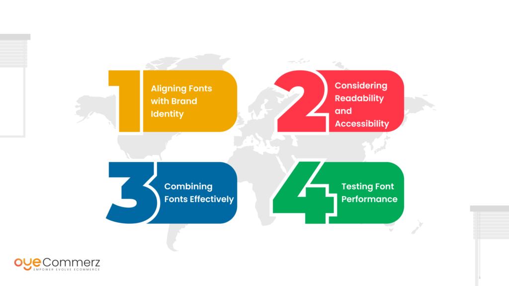
Selecting Fonts for Shopify Themes
Choosing the suitable fonts for the Shopify theme thus needs to be done in a way that it is both attractive to the eyes, and at the same time easily readable.
Aligning Fonts with Brand Identity
There are additional factors to consider when selecting fonts, particularly in the context of UX/UI in developing a Shopify theme. Your font choice should align with your brand’s personality. For example, a car manufacturer’s branding might benefit from using elegant serif fonts, while a technology company might opt for sleek, modern sans-serif fonts to better reflect its innovative image.
Considering Readability and Accessibility
Select fonts that are easily readable on both PC &/or Mac and other computing devices. For the body text avoid the use of flashy fonts and ensure the text contrast with the background is well contrasted. For convenience and UMMS users with special needs, such as visually impaired users, accessibility should not be an issue.
Combining Fonts Effectively
Sometimes applying two different fonts makes the layout more interesting, however, the fonts should be related in some way. The most frequently used design technique is to use a serif typeface for the titles and a closely related sans-serif typeface for the text.
Testing Font Performance
It may be wise to check the chosen fonts as normal and in some other conditions to evaluate its result. This entails a check on how they appear when placed on various interfaces and when one is compared with another’s, their effects on page space, and time among others. The font files may have a significant impact on the loading time of the page, so go for fonts that have little or no impact at all on the loading time of the page.
Typography Trends in Shopify Theme Design
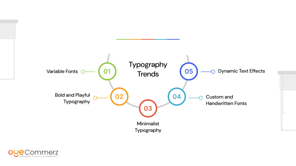
Being a trendy Shopify store owner, you must be aware of typography trends that can enhance your store’s look. Here are some current trends to consider:
Variable Fonts: Variable fonts envisage different styles within one font file, providing more opportunities and also loading less time. This is becoming popular since it makes the text alive and adapts to an intended context or a particular message.
Bold and Playful Typography: These days, a huge number of brands experiment with distinct fonts, especially the ones that will draw more attention of the public. It will also make your store more engaging and memorable to your target audience which is very crucial in the marketplace.
Minimalist Typography: As a matter of fact, minimalist typography does not complicate anything by utilizing clear lines and creating lots of white space. This trend is popular for making very classy designs which are more or less about user-friendly designs that aim at being as easy to read as possible.
Custom and Handwritten Fonts: Original and calligraphy typefaces may bring a remarkable look to your store’s design differentiating it from the others. These fonts can easily present truth and a more intimate characteristic, especially for specialized markets.
Dynamic Text Effects: Expanding, different effects such as animated text or texts with interactive elements are appearing, thus using a layer of interaction. Such effects can be used occasionally to draw attention to some components as well as enrich the perception of the user interface.
While incorporating these trends, it’s important to consider the Cost of Developing a Custom Shopify Theme. Investing in custom typography and design elements can significantly impact your store’s branding and user experience, but it’s crucial to balance these enhancements with your overall budget.
Transform Your Shopify Store with OyeCommerz!
At OyeCommerz, we specialize in creating custom Shopify themes that leverage the power of typography to elevate your e-commerce presence. Whether you need guidance in selecting the perfect fonts or want to stay ahead with the latest design trends, our team of experts is here to help. Ready to take your Shopify store to the next level?
Contact OyeCommerz today and let’s create a visually stunning, user-friendly site that drives results.
Contact to Migrate your Site to Shopify Now
Conclusion
Typography is a powerful tool in Shopify theme customization that goes beyond mere aesthetics. By understanding its role and impact, you can create a visually appealing and functional e-commerce site that effectively communicates your brand’s identity and enhances user experience. From choosing the right fonts to keeping up with trends, thoughtful typography can drive user engagement, improve readability, and ultimately boost conversions. As you refine your Shopify store, remember that every detail counts and typography is a crucial element that can make a significant difference in your online presence.