
In the current world that is rapidly embracing technology and innovation, the use of mobile gadgets is inevitably incorporated in societies. For businesses, especially those that operate in the highly contested e-commerce sector, this change has presented a new imperative. 24.77% of Shopify Traffic Comes From Mobile Devices. As mobile shopping becomes the industry standard, your Shopify Plus store is likewise to be optimized for use across mobile devices. Failing to be conversant with them can make one miss business opportunities and thus unique revenue streams.
Shopify Plus, known for its extensive features, flexibility, and adaptability, is the ideal solution for businesses looking to unlock the full potential of mobile commerce. However, one of the most critical factors influencing both the performance and the overall look and feel of your Shopify Plus store is how well it is optimized for mobile platforms. Mobile Design on Shopify Plus Stores plays a pivotal role in ensuring your business not only thrives but also delivers a seamless and engaging experience to its users. In this blog, we’ll dive into how mobile design impacts your Shopify Plus store and why it’s essential for driving growth and success.
Table of Contents
ToggleUnderstanding Mobile Design on Shopify Plus Stores
In simple terms, mobile design is not just about the shape-shifting of your website for Smartphones and tablets. It embraces the general impression that users get especially when they have to access your site through a mobile device. This ranges from how fast a page takes to load, how easy it is to click from one page to the other, the print size and contrast, and how long it takes to check out. The responsive design guarantees that when accessed on a mobile device, your Shopify Plus store is not only beautiful but optimized for smaller screens.
Key Elements of Mobile Design
- Responsive Design: This helps to guarantee that your website layout is responsive to different dimensions of the screen and their orientation.
- Touch-Friendly Navigation: Mobile users are usually interacting through touch screens hence the buttons and links need to be big enough to be recognized without zooming.
- Fast Load Times: Mobile users are usually ‘on the road’ and do not have a lot of time to spend. Failure to load can cause high bounce rates and lost sales hence the need to have a fast-loading business site.
- Readable Content: Font sizes and spacing should be effective for them on small screens to avoid the need to zoom in for every input to be seen.
The end aim of mobile design is to make a site look and function in a way that optimally satisfies the requirements of the user of a mobile device; the users should be able to navigate with a device, shop, and even pay for goods without much of a hassle.
Rising Significance of Mobile Commerce
The term mobile commerce, or m-commerce as it is commonly called, has nothing short of a meteoric rise. The use of mobile devices as the gateway to the internet has been on the rise in the past few years surpassing the use of desktop devices. Some of the current research findings reveal that mobile commerce sales are likely to contribute 72.6% of the overall e-commerce sales in the year 2021. This shift underlines how you ought to be supporting the mobile experience on your Shopify Plus store.
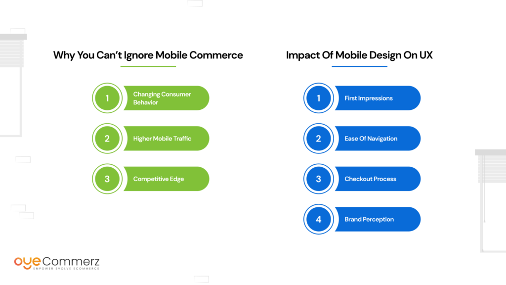
Why You Can’t Ignore Mobile Commerce
- Changing Consumer Behavior: Today’s customers want the luxury of shopping on their mobile devices. Whether it is for online shopping whilst on a bus, or to make some impulse purchases on the move, it is now common to shop on a mobile device.
- Higher Mobile Traffic: The use of mobile devices for getting to the websites of businesses that operate online has also become common. If your store operates on Shopify Plus, it is paramount that your website is also mobile-friendly since you would otherwise be losing a significant market share.
- Competitive Edge: Much more, firms that embrace mobile design have an edge over their rivals. Optimizing for mobile is critical because it can place your brand ahead of those organizations that may be outdated in terms of mobile optimization.
The more the number of people shopping with their gadgets, the more the reliance of the Plus store on Shopify is anchored on how it performs in mobile solutions. The consequences may be highly costly: less traffic, and subsequently, fewer conversions, and finally, fewer sales.
Impact of Mobile Design on User Experience
It is the user experience that lies at the center of every successful e-commerce company and the mobile design at its core. Regarding mobile UX in the context of a Shopify Plus store, a better mobile user experience results in more engagement, better conversion rate, and brand loyalty. However, if a mobile experience is negative, users are likely to run away and this can hurt your brand.
Impact of Mobile Design on UX
- First Impressions: The mobile site is viewed by more people and itself often becomes the first point of contact between a customer and your brand. This styling is fast and has a good first contact that may make users want to go further on the website.
- Ease of Navigation: Mobile consumers’ have the attitude like let me see it or allow me to get it in the shortest time possible. To achieve the intended goal, mobile interface design with easy-to-navigate also minimizes frustration to ensure the user achieves their intended tasks seamlessly.
- Checkout Process: The design of checkouts can definitely at times be decisive for success in the mobile environment. This, in a way and in a nutshell, tells us that optimized, optimized checkout procedures that are specifically tailored to mobile users can notably decrease cart abandonment rates and notably increase sales figures.
- Brand Perception: The general look and feel of your mobile design are a clear representation of your entire brand. A clean neat mobile site adds to the whole perception of credibility, and professionalism while a noisy, old-looking mobile site is the opposite.
Mobile design for your Shopify Plus store is not just about graphics but more about usability, which if improved, results in increased customer satisfaction and hence increased sales.
Related Read: The Role of UX/UI in Shopify Plus Design
Shopify Plus Mobile Design Best Practices
To fully realize all the potential of mobile commerce, representing one of the most promising directions for development, your store on Shopify Plus must be optimized for mobile access. They help sustain the professional and even beautiful appearance of your site while making sure it is workable and reroutable for sale.
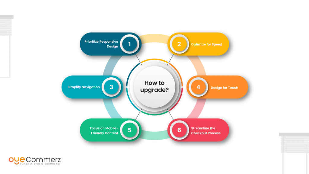
1. Prioritize Responsive Design
Without further ado, here is the first rule of Web design: there is no way around responsive design in today’s world of mobile-first design. A Shopify Plus store should be fully responsive and adapt to the size of the device be it a smartphone, a tablet, or a desktop device. This makes it possible for users to easily get along with your site irrespective of the platform they are on.
2. Optimize for Speed
One clear fact is that page loading time is inversely proportional to both user satisfaction and conversion rate. Consumers on mobile devices are particularly intolerant of latency, making it crucial to have an optimized website in this regard. To improve Shopify Plus store speed, it’s essential to optimize images, minimize code, and enable browser caching techniques. By doing so, you reduce the risk of users abandoning your site due to slow loading times, ensuring a smoother and more engaging experience.
3. Simplify Navigation
Your site should be easily navigable by the mobile users. Adopt an uncluttered and hierarchical approach in laying out your site’s menu and guarantee that crucial actions like ‘Add to Cart’ or ‘Checkout’ are highly visible. It will be recommended to use a sticky header/footer since some of the links will need to be easily accessible and identifiable as the user scrolls through the page.
4. Design for Touch
Mobile devices make use of the touchscreen interface; therefore, the site design has to correspond to this. Make sure that buttons, links, and other clickable areas are large enough to be recognized with fingers and are far enough from each other not to cause unwanted presses.
5. Focus on Mobile-Friendly Content
The content that is effective on the desktop interface may not be effective when the user is viewing it on a mobile device. You also have to realize that your content has to be mobile-friendly so use large fonts, small paragraphs, and bullet points. Also, when designing the system, one should incorporate features such as collapsing and expanding panels to maintain and preview the content on tablets.
6. Streamline the Checkout Process
The actual physical journey of going through the checkout process is a crucial point in the whole journey and it cannot be ignored that it needs to be workable for mobile users. Reduce the total number of steps to be followed when a customer wants to make a purchase. Accept methods of payment such as Apple Pay or Google Wallet to make the process easier and more efficient.
If you implement these best practices, you can produce a mobile experience that focuses on customers’ needs and meets and possibly surpasses their expectations, increasing the engagement and conversion rate on your Shopify Plus store.
Some Key Mobile Design Mistakes to Be Noticed
Now let’s unveil several anti-tips that can harm your Shopify Plus store even if you strive to make it more mobile-friendly. Below are some of the most common mobile design failings and how they can be prevented.
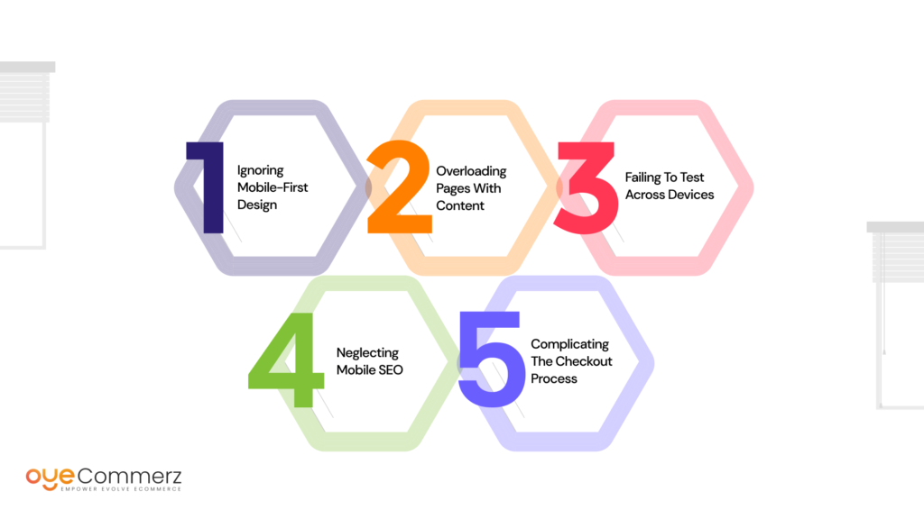
1. Ignoring Mobile-First Design
The strategy of designing your site for the desktop and then trying to transpose it for a mobile experience is, in my opinion, a bad idea. Being created to handle mobile users first, a mobile-first approach creates a more streamlined design and better user experience.
2. Overloading Pages with Content
There is only available space beneath the phone screens and it is detrimental to put too much content under these screens. Your design should always be clean and without lots of complications, you should try to keep only the most critical aspects of your design while leaving out as much extraneous matter as possible.
3. Failing to Test Across Devices
Your Shopify Plus store may be well-designed and look beautiful on one device but can be slow on another. It is always recommended to test your site on multiple devices and sizes to find any problems in advance before becoming a problem for the target users.
4. Neglecting Mobile SEO
There is another symbiotic relationship between mobile design and SEO. For your site not to perform poorly in the search results, especially in front of Google’s mobile-first indexing, your website has to be mobile-friendly. Make sure your wireless site is speedy, nimble, and ready to be indexed in the search engines to gain more hits.
5. Complicating the Checkout Process
According to the statistics, a long and numerous-step process of checkout is one of the key reasons for cart abandonment on mobile devices. Simplify your checkout process, make the number of fields to fill minimal as well as provide an option for customers to checkout as a guest, and ensure that the payment options are optimized for mobile devices as well.
Staying clear of these common pitfalls will ensure a positive user experience and a favorable response to your Shopify Plus store.
Top Shopify Plus Design Trends are set to redefine how businesses approach mobile commerce. Embracing these trends will not only help your store stay ahead of the curve but also create an engaging and seamless experience that drives growth and customer loyalty.
Elevate Your Shopify Plus Store with Expert Mobile Design!
At OyeCommerz, we specialize in crafting seamless, responsive mobile experiences that captivate your customers and boost conversions. Don’t let poor mobile design hold your business back, partner with our expert team to optimize your store for the mobile-first world. Whether you’re looking to enhance user experience, improve load times, or streamline the checkout process, we’ve got you covered.
Contact OyeCommerz today and take the first step towards transforming your Shopify Plus store for mobile success!
Contact to Design your Shopify Plus Store Now !
Conclusion
As mobile commerce continues to evolve, it’s crucial for Shopify Plus stores to prioritize mobile design. A well-optimized mobile design not only enhances usability and user engagement but also significantly impacts key metrics like revenue, sales, and customer retention.
By partnering with a Shopify Plus agency, you can gain a deep understanding of the latest mobile design elements and trends in mobile commerce. With expert guidance, you can seamlessly integrate these elements into your Shopify Plus store, positioning your business to effectively capture the growing mobile market. Conversely, avoiding common mobile design missteps ensures that your store’s performance is both impactful and efficient, leading to stronger results and a more satisfying customer experience.
