
Did you know that over 72% of eCommerce sales come from mobile devices? If your Shopify store isn’t optimized for mobile, you could be losing a huge chunk of potential revenue. In today’s fast-paced digital world, shoppers expect lightning-fast, seamless browsing, whether they’re scrolling through products on their phones or making a quick purchase on the go. A mobile-first Shopify theme isn’t just a design choice; it’s a game-changer for higher conversions, lower bounce rates, and better user experience.
But how do you create a theme that loads fast, looks stunning, and boosts sales? This blog will walk you through the essentials, choosing the right Shopify theme, optimizing speed and performance, improving mobile navigation, and ensuring a smooth checkout experience. We’ll also dive into mobile SEO best practices and testing strategies to make sure your store performs flawlessly across all devices.
By the end, you’ll have a clear roadmap to build a mobile-first Shopify theme that not only attracts visitors but turns them into loyal customers. Let’s get started!
Table of Contents
ToggleUnderstanding the Mobile-First Approach
In today’s eCommerce landscape, mobile shopping isn’t the future, it’s the present. More than half of all online traffic comes from smartphones, and if your Shopify store isn’t designed with mobile users in mind, you’re already falling behind. This is where the mobile-first approach comes into play.
What Is Mobile-First Design?
Mobile-first design means building your Shopify store primarily for mobile devices, then scaling it up for desktops. Instead of designing for a big screen and trying to shrink everything down for mobile, you start with the smallest screen and work your way up. This ensures a clean, fast, and user-friendly experience for the majority of your visitors.
Benefits of a Mobile-First Shopify Theme
- Faster Loading Speed – Mobile-first themes prioritize lightweight design, reducing unnecessary elements that slow down your store. A faster site means lower bounce rates and higher engagement.
- Better User Experience (UX) – Mobile shoppers expect smooth navigation, easy-to-click buttons, and clear visuals. A mobile-first design ensures thumb-friendly navigation, eliminating frustrating pinching and zooming.
- Higher Conversion Rates – A mobile-optimized Shopify store removes buying barriers, making it easier for users to browse, add to cart, and checkout effortlessly. More convenience means more sales.
- Improved SEO Rankings – Google uses mobile-first indexing, meaning it primarily looks at your site’s mobile version when ranking pages. A mobile-optimized store performs better in search results, driving more organic traffic.
Traditional vs. Mobile-First Shopify Store Experience
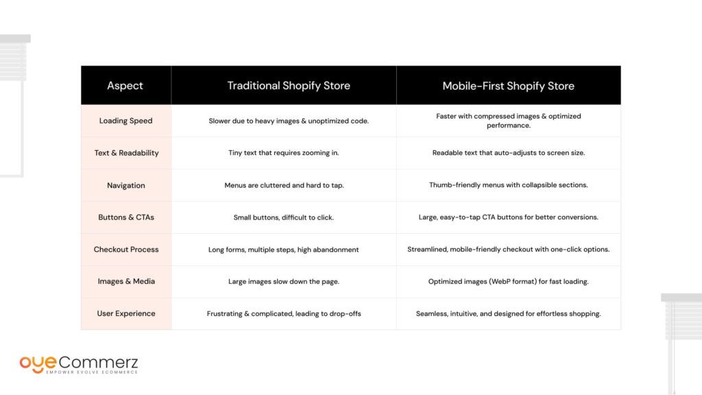
A mobile-first approach ensures smooth browsing, faster checkouts, and higher conversions, making your Shopify store more effective in today’s mobile-driven eCommerce world.
Choosing the Right Shopify Theme
Selecting the right Shopify theme is the foundation of a successful mobile-first store. A well-optimized Shopify theme ensures fast loading speeds, smooth navigation, and a seamless shopping experience for mobile users. But with so many options available, how do you choose the best one? Let’s break it down.
Built-in Mobile-Optimized Themes
Shopify offers several themes that are already optimized for mobile devices. Here are some of the top choices:
- Dawn – A clean, minimalist theme with fast loading speeds and a focus on product visuals. Great for stores looking for a modern look without unnecessary clutter.
- Impulse – A feature-rich theme designed for high-converting stores. It offers advanced filtering, promo banners, and a sleek mobile layout.
- Debutify – A powerful, conversion-focused theme packed with customization options, fast performance, and built-in marketing tools.
These themes come with responsive layouts, meaning they automatically adjust to different screen sizes, making them a great starting point for a mobile-first store.
Customization Options for a Better Mobile Experience
Even with a mobile-friendly theme, customization is key to ensuring a smooth shopping experience. Here’s how you can enhance any Shopify theme for mobile:
- Optimize images and videos – Large, uncompressed media slows down loading times. Use WebP format and lazy loading to speed up performance.
- Adjust button sizes – Make sure all call-to-action buttons (like “Add to Cart” and “Buy Now”) are large, thumb-friendly, and easy to tap.
- Simplify menus – Use a hamburger menu for easy navigation instead of cluttered links.
- Improve font readability – Use clear, legible fonts that are easy to read on smaller screens.
What to Look for in a Mobile-First Theme?
Before selecting a Shopify theme, ensure it has:
- Responsive design – Adapts perfectly to different screen sizes without breaking layout.
- Lightweight structure – Avoids unnecessary scripts and animations that slow down mobile speed.
- Easy navigation – Includes clear menus, search bars, and well-placed CTAs for a frictionless shopping experience.
Choosing a mobile-first Shopify theme isn’t just about aesthetics, it’s about performance, speed, and seamless usability that leads to higher conversions.
Designing for Speed & Performance
Did you know that a 1-second delay in page load time can decrease conversions by 7%? In the fast-paced world of eCommerce, speed isn’t just important, it’s critical for success. When a shopper lands on your Shopify store, they expect an instant, smooth experience. If your site lags, they won’t wait. Instead, they’ll bounce to a competitor’s store, costing you potential sales.
Why Speed Matters for Sales?
Speed plays a direct role in user experience, SEO rankings, and conversion rates. Studies show that:
- 53% of mobile users abandon a site that takes more than 3 seconds to load.
- A 1-second delay can result in a 16% drop in customer satisfaction.
- Faster websites rank higher on Google, leading to more organic traffic.
A slow-loading Shopify store frustrates users, increases bounce rates, and hurts your bottom line. That’s why optimizing your theme for speed is a must.
How to Optimize Shopify Theme Performance?
Use Compressed Images (WebP Format)
Large image files are one of the biggest culprits of slow page speeds. Use WebP format instead of PNG or JPEG—it offers high-quality images at smaller file sizes, reducing load times without compromising visuals.
Enable Lazy Loading for Images
Lazy loading means images load only when they appear on the screen, rather than all at once. This significantly speeds up initial page load times, keeping users engaged. Shopify’s built-in lazy loading feature can be activated in your theme settings.
Minimize JavaScript & CSS Files
Too many scripts slow down performance. Minify JavaScript and CSS files by:
- Removing unused code
- Combining files where possible
- Using asynchronous loading so scripts don’t block page rendering
Use Shopify’s CDN for Faster Delivery
Shopify offers a built-in Content Delivery Network (CDN) to serve your store’s content from the closest server to the user. This reduces latency and speeds up load times, especially for international customers.
Analyze Your Mobile Site Speed
Use Google PageSpeed Insights to check your Shopify store’s performance. This free tool provides detailed insights and suggestions on how to improve your mobile speed, helping you create a fast, seamless shopping experience that drives more sales.
Enhancing Mobile Navigation & UX
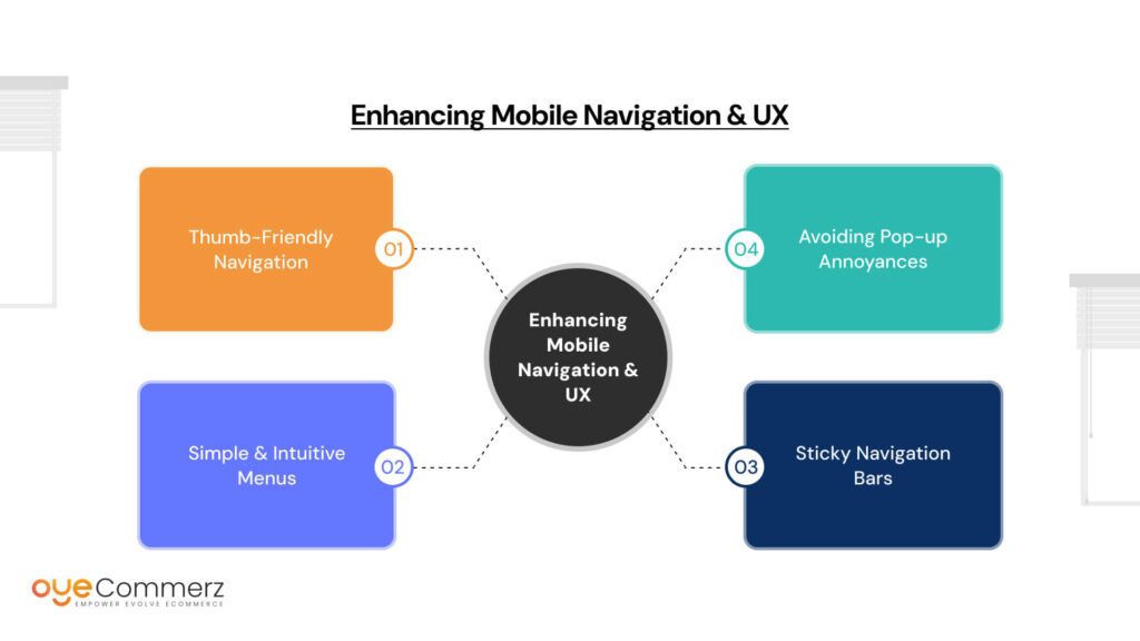
A well-designed Shopify store isn’t just about looks, it’s about creating a smooth, effortless experience for mobile shoppers. If users struggle to navigate your store, they’ll leave before making a purchase. Mobile UX (User Experience) is all about making shopping easy, intuitive, and frustration-free. Here’s how you can optimize navigation to boost conversions and keep customers engaged.
Thumb-Friendly Navigation
Think about how you hold your phone, most people use their thumb to scroll, tap, and navigate. That means your store’s buttons, menus, and key actions need to be easily accessible within the thumb’s natural reach.
Here’s how to make navigation thumb-friendly:
- Large, tappable buttons – Make sure all buttons, especially “Add to Cart” and “Checkout,” are big enough to tap without zooming in.
- Well-spaced links – Avoid placing links too close together, preventing accidental clicks.
- Bottom navigation bar – Placing important icons (like Cart, Home, and Search) at the bottom of the screen makes navigation easier.
Simple & Intuitive Menus
A cluttered menu overwhelms visitors and leads to higher bounce rates. Keep your navigation simple with collapsible menus that reveal options only when needed.
- Hamburger Menu: A compact, three-line menu icon that expands when tapped—ideal for saving screen space.
- Clear Category Labels: Use familiar, straightforward labels like “Shop,” “New Arrivals,” and “Best Sellers” to avoid confusion.
- Logical Hierarchy: Organize products in a structured manner so users can quickly find what they need without endless scrolling.
Sticky Navigation Bars
Ever visited a site where you had to scroll all the way up just to access the search bar? Annoying, right? That’s why sticky navigation bars are a game-changer.
A sticky header keeps essential tools, like the search bar, cart, and menu, visible at all times, making it easier for shoppers to browse and buy.
Benefits of sticky navigation:
- Instant access to search & cart without scrolling.
- Faster product discovery, leading to higher conversions.
- Better usability, especially for larger stores with multiple categories.
Avoiding Pop-up Annoyances
Pop-ups can be effective for collecting emails or promoting discounts, but on mobile, they can be intrusive and frustrating. Instead of aggressive pop-ups, opt for subtle banners that don’t block the screen.
- Use exit-intent pop-ups that appear only when the user is about to leave.
- Limit full-screen pop-ups, as they can drive users away.
- Try slide-in banners at the bottom of the screen for a non-intrusive experience.
By improving navigation and UX, you ensure that mobile shoppers stay engaged, explore more products, and complete their purchases with ease.
Creating Mobile-Friendly Product Pages
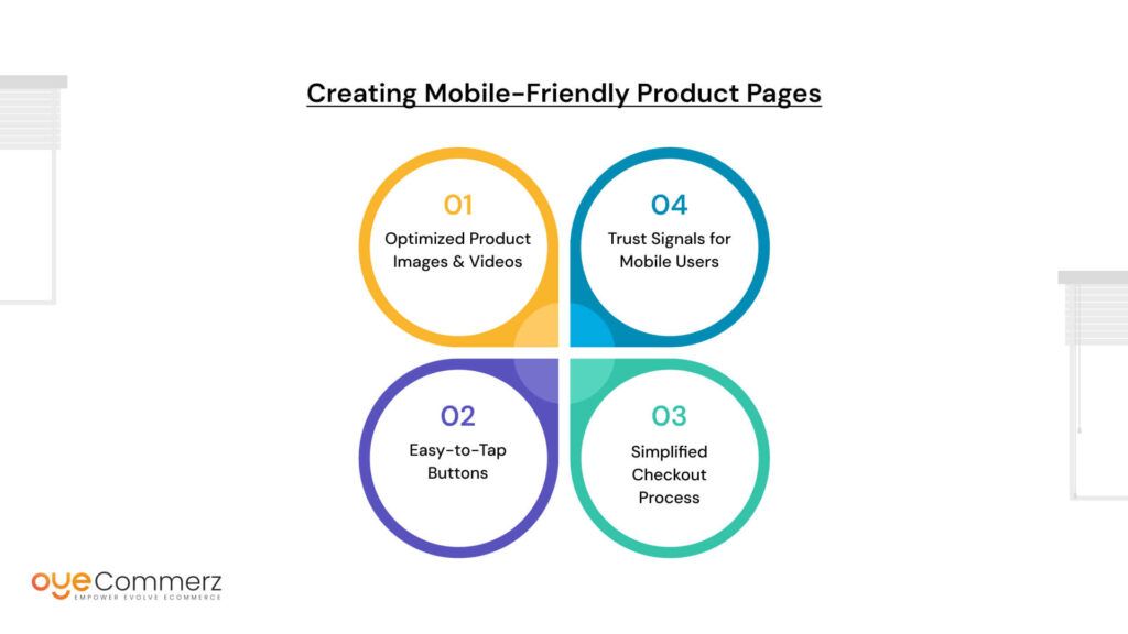
Your product page is where the magic happens, it’s where visitors turn into buyers. But if your product pages aren’t optimized for mobile, you could be losing out on sales. A great mobile product page should be fast, visually appealing, and easy to navigate. Here’s how to create product pages that drive conversions.
Optimized Product Images & Videos
High-quality visuals sell products, but large images and videos can slow down your site if not optimized properly. Mobile users expect smooth browsing, so you need to strike a balance between quality and speed.
- Auto-Scaling Images – Use responsive images that adjust automatically to different screen sizes without distortion.
- WebP Format – Convert images to WebP, which provides high quality at a smaller file size.
- Mobile-Optimized Videos – Host videos on YouTube instead of directly on Shopify to prevent slow loading.
- Zoom & Swipe Features – Allow users to zoom in on product details and swipe through images easily for a seamless experience.
Easy-to-Tap Buttons
When shopping on mobile, tiny buttons are a big frustration. If customers struggle to tap on “Buy Now” or “Add to Cart,” they might give up altogether.
- Large, Finger-Friendly CTAs – Ensure buttons like “Buy Now” or “Add to Cart” are bold, big, and easy to tap.
- Contrasting Colors – Make CTAs stand out from the background so they grab attention.
- Sticky Add to Cart – Keep the “Add to Cart” button visible as users scroll down the page.
Simplified Checkout Process
A complicated checkout process is one of the biggest reasons mobile shoppers abandon their carts. Streamline the process by reducing friction.
- One-Click Checkout Options – Enable Shop Pay, Apple Pay, Google Pay, and other quick payment methods.
- Minimal Form Fields – Only ask for essential details: name, email, and payment info.
- Guest Checkout – Avoid forcing users to create an account before purchasing.
Trust Signals for Mobile Users
Mobile shoppers are more cautious about security. Adding trust signals reassures them they’re making a safe purchase.
- Security Badges – Display SSL certificates and payment security icons.
- Customer Reviews & Testimonials – Show real reviews and ratings to build credibility.
- Return & Refund Policy – Make your refund policy clear and easy to find.
By making your product pages mobile-friendly, you create a frictionless shopping experience that encourages customers to buy with confidence.
Mobile SEO Optimization
Having a stunning, mobile-friendly Shopify store isn’t enough, you need customers to find it. That’s where mobile SEO optimization comes in. Since Google follows mobile-first indexing, it primarily evaluates the mobile version of your site to determine rankings. If your store isn’t optimized for mobile SEO, you could be losing traffic and sales to competitors.
Why SEO Matters for Mobile Sales?
More than 60% of Google searches happen on mobile devices. This means if your Shopify store isn’t ranked high on mobile search results, you’re missing out on potential buyers. Google rewards mobile-optimized sites with better rankings, so focusing on mobile SEO isn’t just an option, it’s a necessity.
Key Mobile SEO Strategies
Use Short, Keyword-Rich URLs
Long and complex URLs are difficult to read and share, especially on mobile. Keep your URLs:
- Short and descriptive (e.g., “yourstore.com/summer-sale” instead of “yourstore.com/collection/summer-sale-2024-best-deals”)
- Keyword-optimized to match what people search for
Optimize Meta Titles & Descriptions for Mobile Searches
Mobile screens show fewer characters in search results than desktops, so your meta titles and descriptions need to be concise and compelling.
- Keep meta titles under 60 characters
- Use action-oriented words like “Shop Now” or “Limited Offer”
- Include relevant keywords naturally
Leverage Structured Data for Rich Snippets
Want your store to stand out in Google search results? Structured data helps display rich snippets like:
- Star ratings from customer reviews
- Price details for quick decision-making
- Stock availability so customers know what’s ready to buy
By implementing these mobile SEO strategies, you make your Shopify store more discoverable, engaging, and conversion-friendly, ensuring higher rankings and more sales!
Testing & Launching Your Mobile-First Shopify Theme
You’ve designed a sleek, high-converting mobile-first Shopify theme, but before you roll it out, testing is key. A glitchy or slow site can instantly turn away visitors. That’s why thorough testing and a strategic launch plan are crucial to ensure everything works flawlessly.
Testing Tools to Use
- Google’s Mobile-Friendly Test
This free tool helps check if your Shopify store is truly mobile-optimized. Just enter your URL, and it will flag any usability issues like text too small to read or buttons too close together. - GTmetrix & Lighthouse for Speed Analysis
A slow site means lost sales. GTmetrix and Google’s Lighthouse help analyze: Page load time, Largest Contentful Paint (LCP) , how fast key elements load, Unnecessary scripts that slow down performance - Cross-Device Testing
Your store should look and function perfectly across all screen sizes. Use BrowserStack or simply test on different devices (smartphones, tablets, and desktops).
A/B Testing for Best Conversions
Want to maximize conversions? Try A/B testing—this means testing two different versions of an element to see which performs better.
- Test different CTA placements – Does a “Buy Now” button work better at the top or bottom?
- Experiment with button colors & text – Small tweaks can increase click-through rates.
- Compare navigation styles – Test collapsible vs. visible menus for smoother browsing.
Rather than launching to all visitors at once, a soft launch lets you gather feedback and fix issues before a full rollout.
- Release to a small audience (e.g., loyal customers or a test group).
- Monitor site performance – Track loading speed, checkout flow, and bounce rates.
- Make final tweaks – Fix anything that affects user experience or conversions.
Once everything is optimized and running smoothly, launch your mobile-first Shopify theme store-wide and get ready for higher engagement, lower bounce rates, and more sales!
Ongoing Optimization & Future Trends
Creating a mobile-first Shopify theme isn’t a one-time task it’s an ongoing process. Consumer behavior, Google’s algorithms, and eCommerce trends constantly evolve, meaning your store needs to adapt to stay competitive.
Why Optimization Never Stops?
Changing Consumer Behavior – The way people browse and shop online keeps shifting. What worked last year might not be as effective today. For example, one-click checkouts and mobile wallets are now preferred over traditional checkout forms.
Google’s Algorithm Updates – Google continuously updates how it ranks websites. A theme that’s optimized today might need adjustments later to keep up with SEO best practices.
New Shopify Features – Shopify frequently introduces new tools and integrations that can enhance mobile shopping experiences. Staying updated can give your store an edge over competitors.
Future Trends in Mobile Commerce
The future of eCommerce is mobile-first, fast, and personalized. Here are the key trends shaping the industry:
AI-Driven Personalization
AI is revolutionizing mobile shopping by offering personalized product recommendations based on browsing history, purchase behavior, and customer preferences. This helps increase conversions by showing shoppers exactly what they want.
Voice Commerce
With voice assistants like Alexa, Siri, and Google Assistant, more users are searching and shopping through voice commands. Optimizing your Shopify store for voice search-friendly keywords can help capture this growing audience.
Augmented Reality (AR) Shopping
AR lets customers visualize products in real-world settings before purchasing. Many brands are already using AR-powered try-ons for fashion, furniture, and cosmetics, reducing return rates and boosting buyer confidence.
A successful mobile-first Shopify store isn’t just about setting it up and forgetting it, it’s about constant improvement. By staying updated with new trends and optimizing regularly, you can ensure a seamless, high-converting mobile shopping experienc for your customers.
Ready to Skyrocket Your Shopify Store’s Sales?
Your eCommerce success starts with a high-performing, mobile-first Shopify theme, and we’re here to make that happen! Whether you need a customized theme, speed optimization, or seamless mobile navigation, Oyecommerz’s expert team ensures your store is built for maximum conversions. Don’t let slow load times or poor mobile experience hold your business back. Partner with us today and transform your Shopify store into a sales-generating powerhouse!
Get in touch now and let’s build something amazing together!
Ready to Integrate with Shopify?
Let Us Help You
Conclusion
A mobile-first Shopify theme isn’t just an option, it’s a necessity. Fast loading speeds, smooth navigation, and optimized product pages can significantly boost conversions and customer satisfaction. Prioritizing SEO, performance, and UX ensures your store stays ahead in the competitive eCommerce landscape.
Now’s the time to analyze your Shopify store. Does it load quickly? Is it easy to navigate? Are your product pages optimized for mobile shoppers? If not, start implementing mobile-first strategies today.
The future of eCommerce is mobile, and your store needs to be ready. Make the shift now, optimize continuously, and watch your sales grow!
