

“Struggling to provide a seamless shopping experience on mobile devices? You’re not alone.”As eCommerce continues to grow, more shoppers are choosing to browse and buy from their smartphones. However, many Shopify store owners overlook one critical aspect, mobile optimization. A theme that looks perfect on a desktop may become clunky and difficult to navigate on mobile, causing slow load times, distorted layouts, and frustrating checkout experiences.
With over 70% of online traffic coming from mobile devices, ignoring mobile responsiveness can drive potential customers away and significantly reduce conversions. Poor mobile experiences not only affect user satisfaction but also harm your search engine rankings, making it harder for new customers to find you.
This blog is your step-by-step guide to transforming a non-mobile-friendly Shopify theme into a high-performing, mobile-ready store that boosts customer engagement and increases sales.
Table of Contents
ToggleUnderstanding Why Mobile Optimization is Crucial
The Mobile Commerce Boom
The shift to mobile shopping is no longer just a trend, it’s the new reality. By 2027, mobile commerce (m-commerce) is expected to account for a staggering 72.9% of all eCommerce sales. Shoppers prefer the convenience of browsing and purchasing products on their smartphones, making it essential for businesses to provide a smooth, hassle-free mobile experience. Customers expect fast-loading pages, intuitive navigation, and seamless checkout processes. If your store falls short, potential buyers won’t hesitate to leave and look elsewhere.
Consequences of Ignoring Mobile Optimization
Failing to optimize your Shopify store for mobile can lead to:
- Higher Bounce Rates: Slow, unresponsive pages frustrate users, causing them to abandon your site quickly.
- Lower Conversion Rates: Poorly designed mobile interfaces make it difficult for shoppers to complete purchases, leading to increased cart abandonment.
- Negative Impact on SEO: Google favors mobile-friendly websites. An unoptimized theme can push your store down in search rankings, making it harder for potential customers to find you.
Why Shopify Stores Are Vulnerable
While Shopify offers numerous theme options, not all of them are mobile-friendly by default. Many older Shopify themes were originally designed for desktop users, with minimal attention given to mobile optimization. These themes often struggle to adapt to different screen sizes, leading to distorted layouts and broken functionality on smartphones and tablets.
Even if you’ve chosen a friendly Shopify theme, without proper adjustments, it may still fail to deliver a flawless mobile experience. Adapting to mobile browsing behavior requires more than just a responsive design, it involves fine-tuning performance, enhancing UX, and ensuring that every touchpoint is optimized for speed and ease of use.
Diagnose Your Shopify Theme’s Mobile Issues
How to Run a Mobile Compatibility Test
Before making any changes to your Shopify store, it’s essential to assess how well your current theme performs on mobile devices. Fortunately, several reliable tools can help you identify problem areas:
- Google Mobile-Friendly Test: This free tool analyzes your site’s mobile responsiveness and highlights issues that affect the user experience. Simply enter your store’s URL, and the tool will provide a detailed report on whether your theme meets Google’s mobile optimization standards.
- PageSpeed Insights: Speed is a crucial factor in mobile shopping. PageSpeed Insights evaluates your store’s load time, interactivity, and visual stability, assigning a performance score for both desktop and mobile. A score below 90 on mobile indicates that your site may need significant improvements.
Key Areas to Check Manually
Even if your theme passes automated tests, manual testing is critical to ensure a flawless experience. Pay attention to the following areas:
- Layout and Design: Review how your store appears on different mobile devices. Are the images, text, and buttons properly aligned? A friendly Shopify theme should maintain consistent spacing and visual hierarchy across all screen sizes.
- Navigation and Menu Usability: Check if your menu is easy to navigate. Are key categories and products accessible within a few taps? Complicated or hidden menus can frustrate users and lead to high bounce rates.
- Checkout Experience: Test the checkout process on mobile. Is it quick, secure, and hassle-free? Slow, multi-step checkouts often result in abandoned carts.
Red Flags to Watch For
Certain signs indicate that your Shopify theme is not fully optimized for mobile. Look out for:
- Distorted Visuals and Text Misalignment: Elements that appear fine on desktop may look out of place on mobile. Misaligned images or text can ruin the browsing experience.
- Slow Load Times Exceeding 3 Seconds: Mobile users expect fast responses. Studies show that a delay of just one second can reduce conversion rates by 7%.
Complicated or Multi-Step Checkout Processes: Lengthy, complex checkouts are a conversion killer. Ensure that mobile users can complete their purchases in a few simple steps.
Quick Fixes to Enhance Mobile Responsiveness
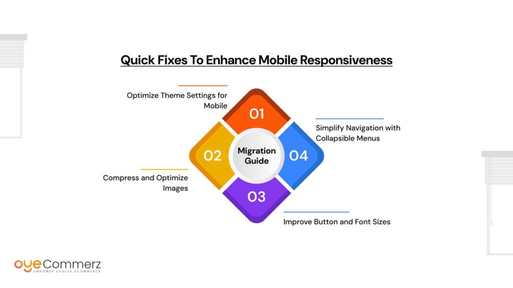
Optimize Theme Settings for Mobile
The easiest way to improve mobile responsiveness is by adjusting your Shopify theme’s built-in settings. Many themes, including a friendly Shopify theme, come with basic mobile optimization options that can be enabled with just a few clicks.
Steps to Enable Mobile Optimization:
- Go to Online Store > Themes > Customize from your Shopify dashboard.
- Look for mobile-specific settings, often found under the Layout or Design sections.
- Enable responsive layout options to ensure your theme adapts to different screen sizes.
If your current theme lacks these features, consider exploring newer themes that offer mobile-friendly customization.
Compress and Optimize Images
Large, high-resolution images can significantly slow down your website on mobile devices. Since mobile users expect pages to load in three seconds or less, optimizing images is a quick win.
Recommended Tools:
- TinyPNG: Compresses images without losing quality.
- ImageOptim: Ideal for reducing file sizes while maintaining clarity.
- Shopify’s Native Image Optimizer: Automatically optimizes images during upload.
To ensure faster load times, use JPEGs for product photos and PNGs for graphics and logos.
Improve Button and Font Sizes
Tap targets that are too small or fonts that are difficult to read can ruin the mobile experience. Ensure that buttons are large enough to be tapped easily and that text is legible on smaller screens.
- Tap Target Size: Buttons should be at least 44×44 px to prevent accidental clicks.
- Font Size: Increase the base font size to a minimum of 16px for readability.
Also, ensure that there’s adequate spacing between clickable elements to avoid frustrating mobile users.
Simplify Navigation with Collapsible Menus
Mobile users prefer simplicity. Cluttered menus or difficult-to-navigate pages can lead to high bounce rates. Implement accordion-style menus or collapsible menus to make navigation cleaner and more intuitive.
Benefits of Collapsible Menus:
- Keep the interface clean by displaying only key options.
- Allow easy expansion of relevant sections when needed.
Additionally, adding sticky navigation bars ensures that essential pages (like Cart and Search) are always accessible, regardless of how far users scroll.
Using Shopify Apps to Improve Mobile UX
Best Apps to Optimize Mobile Layout and Performance
Enhancing mobile user experience (UX) goes beyond making your Shopify theme responsive. Leveraging powerful Shopify apps can help fine-tune your store’s layout and boost performance. Here are some of the best apps to consider:
- Tapcart: This app transforms your Shopify store into a fully functional mobile app, offering a seamless and app-like experience for users. It allows customers to browse, add to cart, and check out with ease, resulting in higher retention and conversion rates.
- Shogun: A versatile drag-and-drop page builder, Shogun provides advanced mobile preview functionality, allowing you to design and test mobile layouts before going live. This ensures that your store looks polished and performs well on any device.
- PageFly: Ideal for creating custom, mobile-optimized landing pages, PageFly offers responsive design capabilities that adapt seamlessly to various screen sizes. With its easy-to-use interface, you can build pages that maintain a consistent experience across devices.
Implementing AMP for Shopify
For stores experiencing slow load times, Accelerated Mobile Pages (AMP) can dramatically enhance speed and mobile performance. AMP creates lightweight, fast-loading versions of web pages that prioritize performance on mobile devices.
Benefits of AMP for Shopify:
- Faster Load Times: AMP reduces page load speed by up to 85%, ensuring that mobile users stay engaged.
- Improved SEO Rankings: Google favors AMP-enabled pages, boosting your store’s visibility in search results.
- Lower Bounce Rates: Faster pages mean fewer frustrated users leaving your site.
To implement AMP in your Shopify store, consider using apps like AMP by Shop Sheriff or FireAMP to automatically create AMP-compliant versions of your pages.
Installing a Mobile Theme Switcher
If your current theme struggles to provide an optimal mobile experience, installing a mobile theme switcher can offer a quick fix. This tool automatically switches your Shopify store to a mobile-optimized version, enhancing usability for smartphone and tablet users.
Why Use a Mobile Theme Switcher?
- Ideal for stores with diverse product catalogs or high traffic volumes.
- Ensures a streamlined mobile experience without requiring a full theme overhaul.
Custom Code Hacks to Optimize Mobile Responsiveness
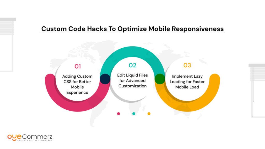
Adding Custom CSS for Better Mobile Experience
If your Shopify theme is not fully optimized for mobile, adding custom CSS can significantly enhance the mobile experience. Using CSS media queries, you can adjust design elements based on different screen sizes to ensure a seamless and visually appealing layout.
What Are CSS Media Queries?
Media queries apply different CSS rules depending on the device’s screen width. This allows you to make your Shopify store responsive without altering the core theme.
Example Code:
@media only screen and (max-width: 768px) {
body {
font-size: 16px;
}
.product-image {
width: 100%;
}
.header {
padding: 10px;
}
}
How It Works:
- Font Size Adjustment: Ensures text is readable without zooming.
- Image Scaling: Resizes product images to fit smaller screens.
- Header Optimization: Reduces padding to maximize space for content.
Edit Liquid Files for Advanced Customization
For more advanced mobile optimizations, editing your theme’s Liquid files allows you to tailor the user experience specifically for mobile users. Liquid, Shopify’s templating language, controls how dynamic content is displayed in your store.
Steps to Edit Liquid Files:
- Go to Online Store > Themes > Actions > Edit Code from your Shopify dashboard.
- Locate and open theme.liquid or relevant template files.
- Insert mobile-specific CSS or JavaScript within conditional Liquid tags to modify the mobile experience.
Example:
{% if template.name == ‘product’ %}
<style>
@media (max-width: 768px) {
.product-title {
font-size: 18px;
text-align: center;
}
}
</style>
{% endif %}
Pro Tip: Always make a backup of your Liquid files before making any changes to prevent errors or data loss.
Implement Lazy Loading for Faster Mobile Load
Slow-loading pages can drive mobile users away and increase bounce rates. Implementing lazy loading ensures that images and other media load only when they come into view, reducing initial page load time and improving overall performance.
How Lazy Loading Works:
When a user scrolls down the page, only the content visible on the screen loads immediately. The rest of the images and assets load progressively as the user navigates further.
Example Implementation:
<img src=”product-image.jpg” loading=”lazy” alt=”Product Image”>
Benefits of Lazy Loading:
- Faster Initial Load Times: Improves page speed, keeping mobile users engaged.
- Reduced Bandwidth Usage: Loads only essential content, saving data for mobile users.
Better SEO Performance: Google favors faster websites, which can enhance search rankings.
Enhancing Mobile Checkout to Reduce Abandonment
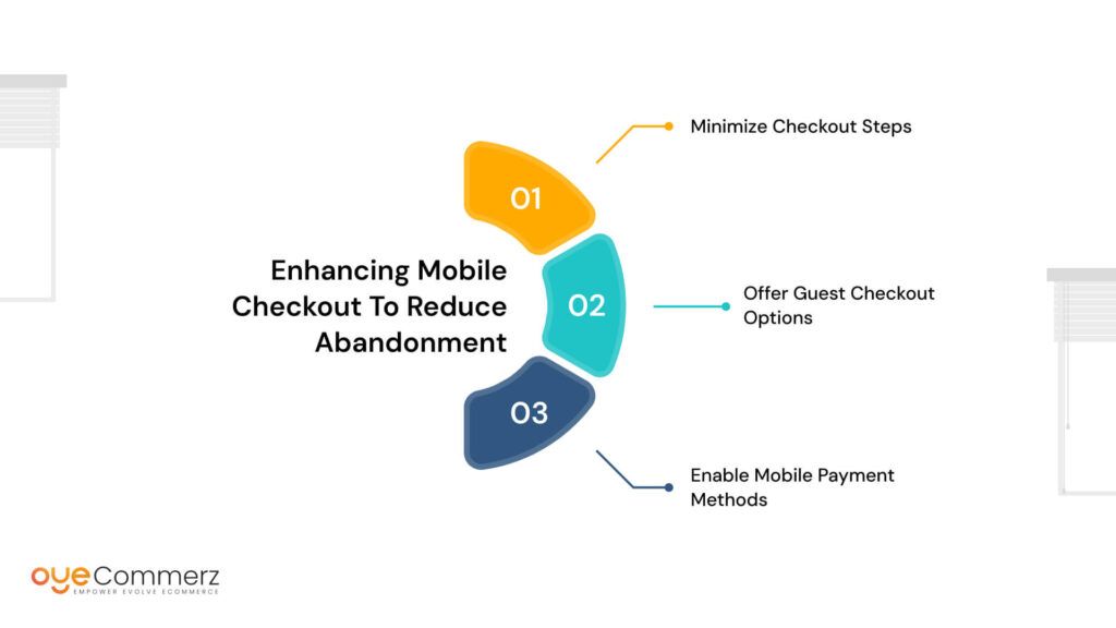
Minimize Checkout Steps
A lengthy, complicated checkout process is one of the biggest reasons for cart abandonment, especially on mobile. To reduce drop-offs, streamline your checkout by minimizing the number of steps required to complete a purchase.
Best Practices to Simplify Checkout:
- Enable One-Page Checkout: Consolidating all necessary information on a single page reduces friction and allows users to complete their purchases faster.
- Use Auto-Fill Options: Auto-fill features pre-populate customer information, making it easier for repeat shoppers to complete forms quickly.
A friendly Shopify theme often includes built-in options to enable simplified, mobile-optimized checkouts. However, if your theme lacks these features, consider using Shopify apps like ReConvert or Checkout Booster to optimize the process.
Offer Guest Checkout Options
Forcing customers to create an account before purchasing can deter potential buyers, especially on mobile where users prefer quick and hassle-free transactions. Offering a guest checkout option ensures that first-time visitors can complete their purchases without unnecessary delays.
Why Guest Checkout Matters:
- Faster Process: Users can skip account creation, reducing checkout time.
- Higher Conversion Rates: Eliminating unnecessary steps prevents drop-offs and increases conversions.
If your current theme doesn’t offer guest checkout by default, enabling it can be done through your Shopify admin panel by navigating to Settings > Checkout and selecting the option to allow guest checkouts.
Enable Mobile Payment Methods
Mobile users expect fast and secure payment options. Integrating mobile payment methods such as Apple Pay, Google Pay, and PayPal One-Touch can create a frictionless checkout experience. These one-click payment solutions allow users to complete their purchases without manually entering their payment details, which significantly reduces cart abandonment.
Benefits of Mobile Payment Integration:
- Faster Transactions: One-click payments reduce the time it takes to complete a purchase.
- Higher Security: Mobile payment methods use encrypted data, offering secure transactions for your customers.
To enable these options, go to Settings > Payments in your Shopify dashboard and activate the relevant payment gateways.
Test and Monitor Mobile Performance Regularly
Run Periodic Mobile Tests
Mobile performance isn’t a one-time fix, it requires continuous monitoring to ensure that your store remains optimized as technology and user behavior evolve. Running regular mobile tests helps identify emerging issues and ensures that your site remains responsive.
Recommended Tools:
- Google Mobile-Friendly Test: Analyze how well your Shopify store adapts to mobile devices and identify areas for improvement.
- PageSpeed Insights: Measure load times, interactivity, and visual stability. Aim for a score of 90 or above to maintain a fast and smooth experience for mobile users.
Additionally, test your store manually on real devices with different screen sizes to assess the user interface (UI) and user experience (UX) firsthand.
Monitor Heatmaps and User Behavior
Understanding how mobile users interact with your store is key to refining the experience. Heatmap tools such as Hotjar and Crazy Egg provide visual insights into user behavior, highlighting where customers engage the most and where they encounter friction.
Benefits of Using Heatmaps:
- Identify Drop-Off Areas: Discover sections where users abandon the site or experience difficulties.
- Refine UI/UX: Make data-driven decisions to optimize layout, button placement, and content flow.
Even if you’re using a friendly Shopify theme, these insights can help fine-tune the mobile experience to increase engagement and conversions.
Track Conversion Rate Differences
Monitoring conversion rates between desktop and mobile traffic is essential for identifying gaps in your mobile strategy. A significant drop in mobile conversions often indicates that certain elements of the mobile experience need improvement.
Key Metrics to Track:
- Cart Abandonment Rate: Analyze where users drop off during checkout.
Bounce Rate: Monitor how quickly users leave your site without taking action.
When to Consider Switching to a Mobile-Responsive Theme
Signs You Should Upgrade Your Theme
Even with extensive optimizations, some Shopify themes may still fall short in delivering a smooth mobile experience. If you notice these persistent issues, it may be time to switch to a more mobile-friendly theme.
Key Indicators:
- Persistent Slow Load Times: Despite compressing images and enabling lazy loading, your site may still load slowly due to outdated theme architecture. Slow load times hurt user experience and increase bounce rates.
- High Bounce Rates and Poor Mobile Conversions: If analytics show a consistently high bounce rate and low conversion rates on mobile compared to desktop, your theme may not be delivering an intuitive or engaging mobile experience.
- Lack of Support for Modern UX/UI Trends: Older themes often lack features like sticky navigation, collapsible menus, and optimized mobile layouts, which are essential for today’s mobile shoppers.
Benefits of Upgrading to a New Theme
Switching to a mobile-responsive Shopify theme can provide immediate improvements in performance and user experience, helping you capture more mobile traffic and drive higher conversions.
Why Upgrading Makes Sense:
- Built-In Mobile Responsiveness: Modern themes are designed to be mobile-first, ensuring that pages automatically adapt to different screen sizes without requiring extensive customizations.
- Improved SEO and Search Rankings: Mobile-optimized themes improve page speed and user engagement, which are key factors that Google considers when ranking websites.
- Enhanced User Experience and Increased Sales: With intuitive navigation, faster load times, and optimized product displays, a mobile-friendly theme encourages users to stay longer and complete their purchases.
Top Mobile-Friendly Shopify Themes to Consider
If you’re ready to make the switch, consider these top-rated mobile-responsive Shopify themes that offer the best balance of performance, flexibility, and user experience.
- Dawn: A free, minimalist theme that is fast, lightweight, and fully optimized for mobile devices. Ideal for small to medium-sized stores looking for a clean and modern design.
- Debutify: A highly customizable, conversion-focused theme with advanced features like upsell options and smart cart functionality. Perfect for growing stores that want to maximize revenue.
Impulse: Best suited for stores with large product catalogs, Impulse offers advanced filtering options, sleek design, and built-in mobile optimization to ensure a smooth shopping experience.
Proactive Maintenance for Long-Term Mobile Success
Conduct Regular Theme Audits
To maintain a seamless mobile experience, regular theme audits are essential. As mobile trends and user expectations evolve, even a friendly Shopify theme can become less effective over time if not updated properly.
Why Theme Audits Are Important:
- Identify Performance Issues: Slow load times, broken elements, or outdated layouts can negatively impact the mobile user experience.
- Keep Up with Design Trends: Modern UX/UI practices change frequently, and regular audits help ensure that your store stays aligned with these trends.
How to Conduct a Theme Audit:
- Quarterly Reviews: Evaluate your store’s mobile performance every three months using tools like Google PageSpeed Insights and Lighthouse.
- Update CSS and Liquid Files: Regularly check for outdated styles and scripts that may affect mobile responsiveness. If necessary, optimize these files to maintain a fast, engaging mobile experience.
Optimize New Content for Mobile
As you add new content to your store, such as product pages, blog posts, or promotions, ensure that it is fully optimized for mobile users. Neglecting mobile optimization for fresh content can lead to inconsistent experiences and increased bounce rates.
Best Practices for Mobile Content Optimization:
- Compress Images Before Uploading: Use tools like TinyPNG to reduce file sizes while maintaining quality. Smaller images load faster on mobile, improving page speed.
- Test New Pages on Multiple Devices: Before publishing, preview content on different screen sizes to ensure a consistent and user-friendly experience.
By optimizing content for mobile as you go, you prevent performance issues and maintain a seamless experience across all devices.
Stay Updated with Shopify’s Latest Features
Shopify frequently releases updates designed to enhance mobile performance and improve user experience. Staying informed about these updates ensures that you’re leveraging the latest tools and features to keep your store competitive.
Why Staying Updated Matters:
- Mobile-Friendly Enhancements: New features often focus on improving mobile load times, navigation, and checkout processes.
- Security and Compliance: Keeping your store updated protects against vulnerabilities that may affect mobile performance.
How to Stay Informed:
- Regularly check Shopify’s Updates Blog for announcements about new features and improvements.
- Join Shopify Communities to stay connected with other store owners and learn about emerging trends.
By conducting regular audits, optimizing new content, and staying updated with Shopify’s latest advancements, you can ensure that your mobile store remains high-performing, engaging, and ready to meet the needs of your growing audience.
Ready to Elevate Your Mobile Experience?
Switch to a friendly Shopify theme or fine-tune your current one to meet mobile users’ expectations. Take action today with Oyecommerz and watch your conversions soar.
Contact us today!
Let's build your custom Shopify app today!
Conclusion
A non-mobile-friendly Shopify theme can significantly impact your store’s performance, leading to higher bounce rates, lower conversions, and frustrated customers. However, by applying the right fixes, such as optimizing your theme settings, compressing images, simplifying navigation, and leveraging mobile-friendly apps, you can transform your store into a mobile-first powerhouse. Regular testing, tracking user behavior, and staying updated with Shopify’s latest features ensure that your mobile experience remains seamless and engaging.
If you’ve implemented these steps but still notice performance gaps, it may be time to switch to a friendly Shopify theme that offers built-in mobile responsiveness and modern UX capabilities. A mobile-optimized theme not only improves user satisfaction but also boosts SEO and increases sales.
